
This post is the first part of a series of posts that will describe my thoughts and technical insights about Seeing, Mixing and Using Colour... Enjoy!
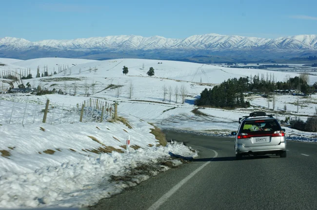
A few years ago I went on a trip to Lake Tekapo in New Zealand with my friend and her little girl called Sophia and we got to see the stunning scenery along the way.
I've always been fascinated to see how the colours change in the mountains as they recede into the distance, how the sky and the atmosphere affect the way we see things. That observant habit that if you are an artist you might know what I am talking about!
Then I asked Sophia what colours she was seeing, and the most interesting thing was that she didn’t see any of the colours I did!
The little girl didn't see blue on the shadowed snow on the mountains or the warm white of the sunlit snow patch.
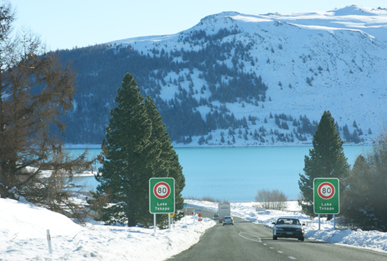
She described snow as white and the trees on the further back mountain as green and so on. And that is how she would've painted them on a first attempt without understanding how light and atmosphere affect the way we see colour.
She frowned her face when I told her what colours I saw there! (like many of my students do when I go through the question "what colour is that?").
I still get amazed at how colour is deceptive. Being more observational certainly changes our perspective on seeing colour. Anything is possible like skies can be green, trees can be blue, a white surface in the shadow can be darker than black in sunlight.
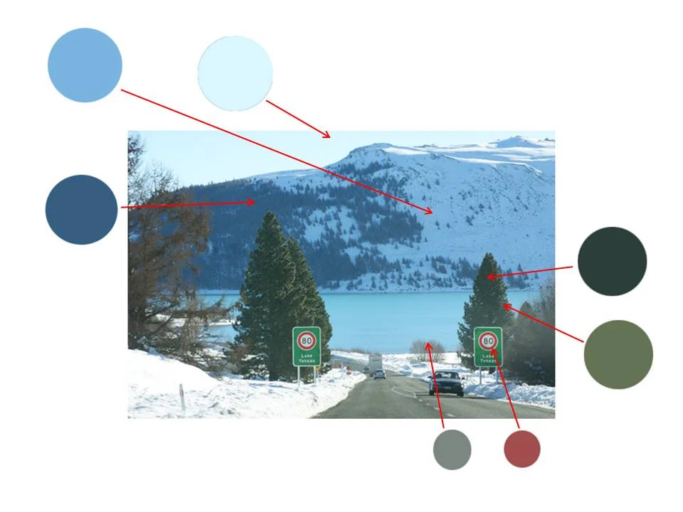
As an example, I used Photoshop to capture the colours of some the main shapes on the image below. Notice how blue the snow is on the background mountain; how different the colour of the background trees (second colour swatch on the left) is from the foreground ones (colour swatches of the right). Then one shape that many beginners would be tempted to paint with red! - the speed sign (see how dull that is on the swatch?)
We are all like little Sophia when we begin learning to paint. The way we see colours when we first start our painting journey is not necessarily the way they truly are. What we see in fact is not what it’s in front of us, but what our brain expects us to see and how we interpret that information through our filters.
We are all born with a disadvantage to see colour accurately called color constancy.
Our brain interprets an object’s colour to be the same regardless different lighting conditions and contexts.
It’s a whole different world and to experience this new perspective, we must learn how to see it as an artist.
That is important because the way we see colours affects directly the way we mix colours.
So developing the skills to see colours accurately takes time, patience, practice and implementation of essential principles and techniques. And interpreting colour into a more creative and open approach takes a lot of efforts.
Applying what it’s been learned and developing a positive learner’s mindset are essential skills to develop. There is so much to discover that it’s easy to forget about what we learned yesterday in the aim to move on to the next challenge.
No one is born with the ability to see colours so well. But the good news is that it’s a skill that can be learned and it becomes easier and accurate with practice and study.
Difficulties come up when painters have no structure through which to filter and interpret what they see. Having a system to organise the complex experience of looking is what has allowed many artists along the history to create works of beauty, harmony and impact.
In the next posts, you'll have a sneak peek into my painting process on these topics - Seeing Colour and Colour Mixing - as I share some insights with you. Stay tuned!
Do you also get amazed with colour relativity? Leave a comment below telling us your experience!
